News
Keysound Blog Takeover: A Guide to The Visual Identity of Keysound by Blackdown
 When you start a label, someone aurally fixated suddenly is asked certain visual questions. What does your sound look like? What images can help booster the impact of the music? Etc. To celebrate the impending Keysound takeover of our Room 3 tonight - and to neatly tie off our week long blog takeover - label co-founder Blackdown explains the stories behind the visuals that have accompanied his label’s 29 releases to date...
 “The first piece of imagery is the least visually “keysound” – the label’s logo. Now it’s unclear why I’ve never mentioned this in public before, but the Keysound label logo was designed by someone who had a pretty weighty impact on dubstep: Loefah.
“Back in 2005 when Dusk and I decided to start a label, we spoke to friends within the dubstep scene who had started labels recently for advice. Kode9, Mala and Pinch were especially helpful getting up and running but it was Loefah who helped with the logo.
“At that time dubstep had yet to explode. We’re talking the year DMZ started and pre Dubstep Warz. ‘Midnight Request Line’ was probably still a dubplate. Loefah had been finishing his art degree and it was clear he had a strong visual sense. He and Pokes had been doing odd jobs but had mentioned they wanted to start a design consultancy, so I headed down to Croydon to chat to them about a commission. We met in the Black Sheep bar - then hosting the proto-DMZ Dubsessions parties, now home to the Croydub raves. Pokes flitted about but Loefah was into the idea. He’d been really into CCTV and surveillance in his degree, but this idea about environment and surroundings, decay and delay, keysounds and keysights had really struck me as what Keysound should be about. So that’s how the slightly distressed logo came about.”
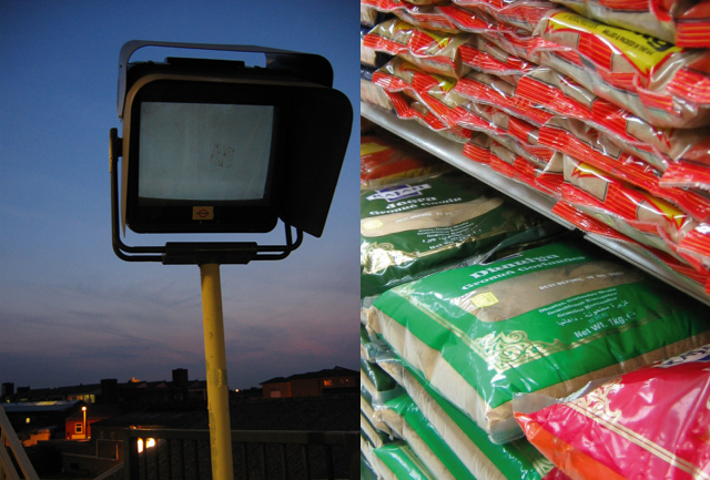 “As the label developed and we began writing beats that contained keysounds and we soon realised the importance of keysights too. If our environment – i.e. the margins of London - and the marginal music scenes of London like the proto grime and dubsep scenes that had inspired us since 2000 were an influence on us, and if we were using circular keysounds to embedded in our tracks to gain a sense of our environment, then we needed the vinyl to reflect that. I remember having this revelation in Dusk’s kitchen, saying to him “… and I’m going to take my camera with me and take shots of London” and him looking at me like I was lightly weird, just as the Asian shopkeeper did when I took shots of huge sacks of spices in Turnpike Lane for the ‘Lata’ 12”. But this was sampling the light of our environment in the way we began sampling the sound of our environment to get a sense of the city and its textures.
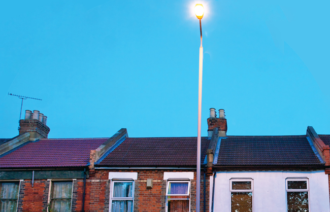
“This discovery of photography, though wildly amateurish (I still don’t really know my ISO from my aperture, unlike Loefah…), made me think more about light. I began to dislike photographs in broad daylight. They lacked drama or sufficient intensity. What dubstep and grime had in common was an edge, a sense of darkness and drama, which 12 noon broad daylight completely lacked. Plus of course all the good club music gets made and played at night, when you feel most alive and your senses are heightened. Yet Keysound as a label wasn’t fully darker than dark either, it sat balanced between light and dark – this is the reason that in 2000 Dusk chose his production name. This made me increasingly fixated with taking shots at twilight, as day became night. This became our label’s visual identity.
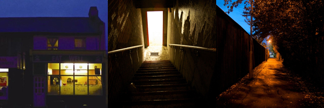 “And between these factors, we came by our visual identity. That we’d use photography (sample the light of our surroundings), choose locations that had meaning to the music and set in lighting that reflected the intensity and mood of our music. Different Keysound releases have been shot by different people: graphic designer Stuart ‘Give Up Art’ Hamersley shot Trim for ‘The Bits’ 12”, my friend Simon Toplis shot ‘Mantis’, ‘Focus’, ‘Kuri Pataka’, Scratcha’s ‘Bullet A’go Fly’, LV’s ‘38 EP’ and the first two LHF 12”s. And Nico Hogg, an amazing visual chronicler of London, gave us some shots for ‘Knife & Gun’ and ‘Yardman’. There’s been others, which we’ll get into...
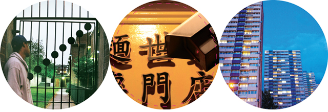
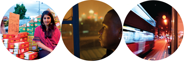 “The visual ideas of the early releases came to a head with the design of our debut album Margins Music, by Stu @Give Up Art. All throughout this period interviewing people had taken me to different far flung corners of greater London, and whether it was to meet Trim in Isle of Dogs, Roll Deep recording near Elephant & Castle, the first dubstep illegal squat parties in east or south to Croydon, or just desolate Hackney Wick, I would take my camera and take some shots en route. I even managed to get a shot of Wiley actually writing lyrics and Danny Weed supping rose. The results really brought all the ideas together, using parts of the shots, textures and tones to create a sense of atmosphere in which our music could sit. The cover was shot by the mighty Shaun Bloodworth, who also shot Grievous Angel’s ‘Soundclash VIP’, the red light above the old booth in Plastic People – now gone. For our album we took him to Green Lanes and the amazingly colourful Turkish and Kurdish fruit & veg shops. I’d always felt they were a great but under-celebrated part of London, which was exactly what Margins Music was all about.”
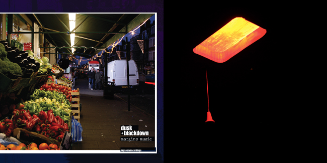 “After the album, we had a kind of rethink about what Keysound could be for and decided to expand its scope beyond just our productions, to fit the producers we were discovering through our Rinse FM show. “
“When we signed Starkey’s ‘Gutter Music’ we had some fun. I located on Flickr a mental photo of north Philadelphia, truly ghetto in a sense few British people can thankfully understand – it looked genuinely apocalyptic. The American photographer was happy to let me use it for a fee. It was getting the fee to him that proved problematic. For some reason I then found myself on the phone to a very camp and sloany gentleman who lived in Hampstead, who explained how he only vaguely knew the photographer in question, couldn’t find the $25 cheque I’d sent him and didn’t care that much as he only dealt in terribly expensive shipments of diamonds. How I’d got from the ghettos of Philly to this turnip in 2 degrees of separation, it wasn’t clear.”
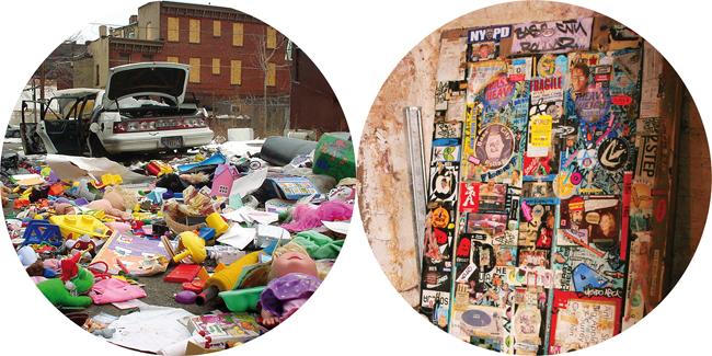 “For the Geeneus ‘Knife & Gun’ 12”, I found this amazing Nico Hogg shot, taken in a towerblock lift in east London. It said “no spitting” in English and presumably Bangladeshi. Given the secondary meaning of “spitting” to MCs, I thought it was perfect, especially when you threw in the multiculturalism undercurrents. Oddly enough I was taken on a tour of old Rinse FM studio locations with Geeneus a few years later and lo and behold, there in the lift was that notice.”
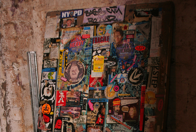
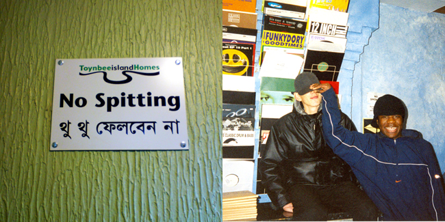 “For the ‘Sweetz (2005 flex)’ 12” by Skream, I asked him to name a location that was foundational to his music and naturally he named Big Apple. The problem was that by then we needed a time machine to visit it. Big Apple was gone (it’s now Mixing Records) and with it all the visual trappings – so I had to do some digging. I got in touch with Jon Kennedy, the unsung hero of that shop (the rest of them – Hatcha, Skream, Benga, Chef, Hijak etc – are all international DJs). He’d been travelling but was thankfully back in the country and willing to help. What he found were some belters of some shots of Benga and Skream in the early days, just teenagers really. But for the A-side I found someone who’d shot a door that had been hammered with promotional garage stickers such it was like the Rosetta Stone for late UKG early “roots of…” dubstep. I annotated it on Flickr with hyperlinks if you want to decode it.”
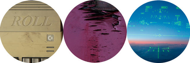
 “We’ve had some fun with more recent shots. Hanging out on the Clapton 38 Bus route with the LV boys, going to the legendarily grimey Cable studios with Scratcha DVA, Nico Hogg shooting the place Balistiq Beats thought was the most “yard” in London (a Jamaican café) as well as the actual barbers that Durrty Goodz got his hair cut as a kid. For Vibezin’s 12” I literally shot his epic vinyl crates. The LHF locations are very personal to their music too, though less can be said about them. For Zed Bias & Steve Gurley’s ‘Roll’, after reading an interview on how Gurley mentored an early Bias and what kit he used, I found an shot of an Amiga and had the text expertly changed. For the Dusk v Kowton EP, the pink flaking paint is actually the top of the recently derelict Rooted Records, the foundational Bristol record store where Peverelist & Kowton worked and Shackleton did in-stores before its sad demise.”
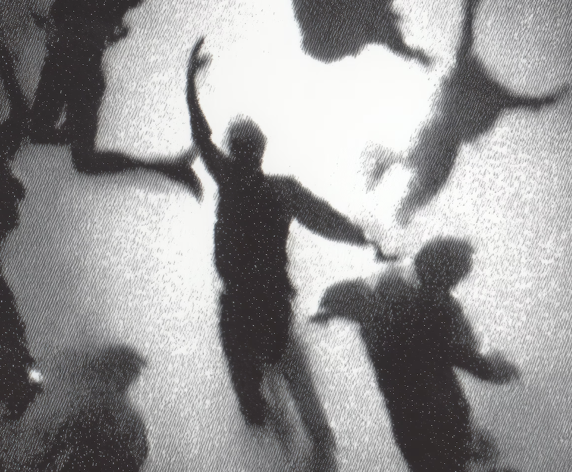
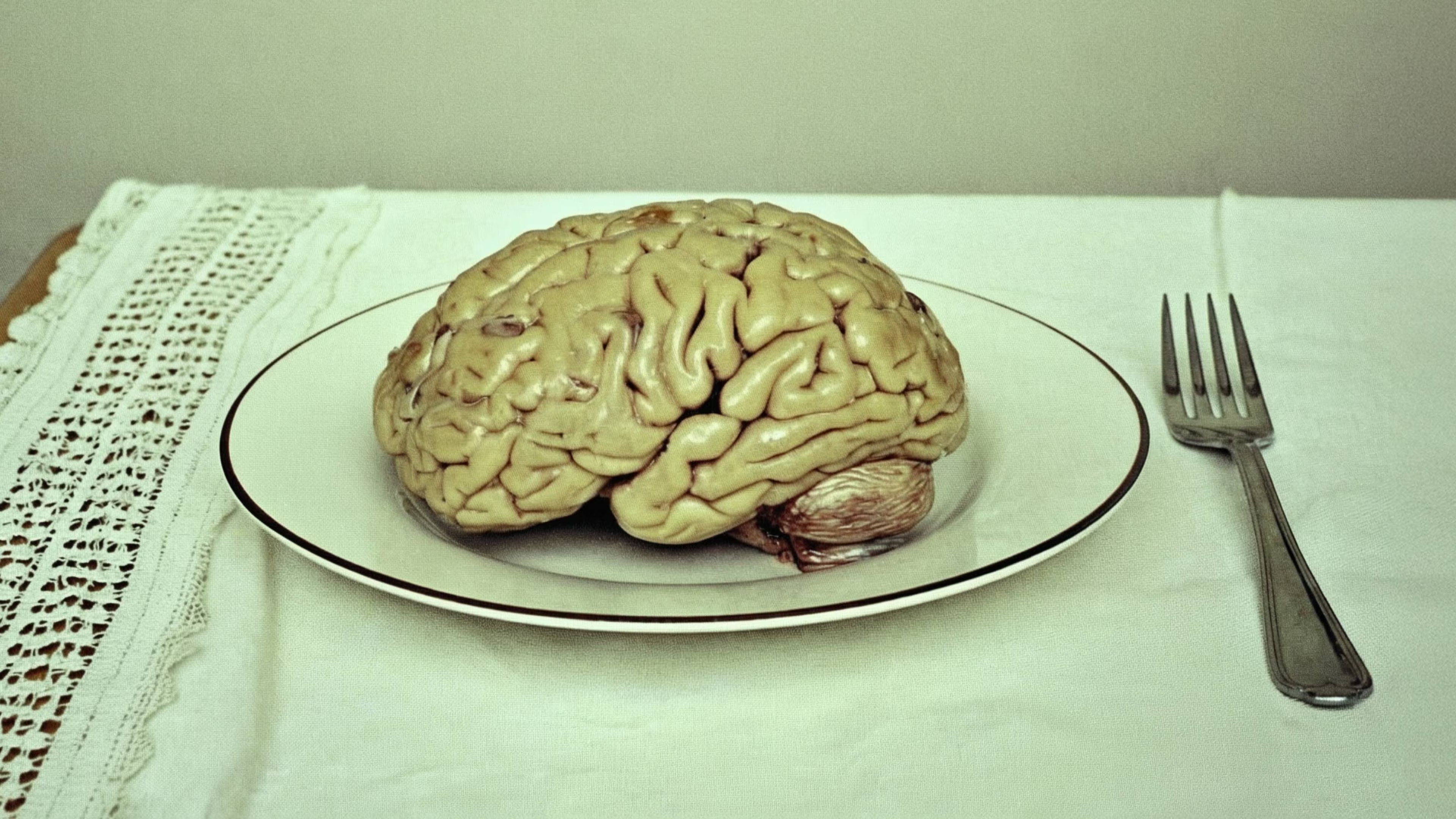
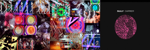
 “For the recent albums on Keysound – LV & Josh Idehen, Sully, Damu and LHF – I felt they needed their own visual identity to mark the size of statement an album makes. Each were quite different but had their own voice. Damu designed his own from start to finish, inspired by a famous but utterly insanely expensive, internationally recognised artist (I asked his agent, I wept at the price…). Sully’s involved us digging around old pathology text books and strange Victorian medical texts before John Coultard, who’s designed our 2011/12 albums, came good.
“But he really took it to the next level with the LHF album. Work actually begun on that (with another artist), nearly three years ago but it’s a testament to the “when it’s done/you’ll know” feeling. Dusk thinks it’s the best art we’ve put out, I’m close to agreeing.”
 “And with the ‘Keepers…’ art, Dusk v Kowton, Bias & Gurley and now Logos, I’m keen to see where this aesthetic can go next. It can’t tread water. I feel the urge to try and expand it, push what is possible and still be recognizably Keysound. We shall see…”
Words by Martin Clark.
Catch the Keysound helmed launch party for LHF's Keepers of the Light featuring LHF, Dusk & Blackdown, LV, Sully, Logos & Vibezin tonight in Room Three.
Tags
No items found.


