News
A Guide to the Visual Identity of Critical Music
 When you start a record label; as an aurally fixated person, you're suddenly asked certain visual questions to help convey the meanings behind the 'sound' of the music and package it up as a singular product. Sure, all art is subjective and the relationship between the two can be tenuous. It can be a tricky business, trying to define the music through visual form, but there’s a really rewarding kind of synchronicity in it when an outfit gets it right.
In the spirit of that statement and ahead of the very first Critical hosted Room One event on Friday, we asked Critical Music boss, Kasra (pictured above), and his designer, Ricky Trickartt to walk us through some of the challenges they’ve faced and the approaches they’ve taken over the years working together to present the Critical output properly.
Kasra: The visual identity of the label is something that is really important to me. My label manager Adam and our designer Ricky can find my particular… shall we say "vision", a little too selective sometimes but I honestly couldn’t have it any other way - if it sounds good and looks good it probably going to be good, right? When I started the label I knew that I wanted to combine my love of drum & bass and the culture that surrounds it with some of my punk/American underground guitar music design ethics and my penchant for more minimalistic designs facets. I’ve never really been a fan of the sci fi influenced d&b cliché to be brutally honest, you can be forward thinking without thinking futuristic or using futuristic imagery.
Ricky: I avoid those d&b sci-fi/dark/CGI clichés like the plague. I avoid most of the modern music and design industries as much as I can too, as it goes. I feel it can all get a bit incestuous. You're not gonna get a unique result by being saturating yourself in what everybody else is doing. Instead I'm usually listening to anything from David Bowie or obscure French library music to some of Donna Summer's cheesiest hits or whatever else my iTunes library decides to shuffle up for me (anything but rockabilly is a rule, not from the 21st century is an unintended habit). I wind up getting my inspiration for projects from conversations with people, which then get filtered and (mis)interpreted in my mind before coming out through my hands.
 K: The logo itself (pictured above), is really simple and really clean and something that always looks good on a record sleeve. It always takes a while for the association to sink in for people but we’re at the point now where we can use the logo without the text and people seem to recognise it as us and know what it means, which is always nice. With regard to our sleeves - I’ve always taken influence from outside of d&b. As I mentioned before, I look to the US underground guitar and noise scene for a lot of inspiration as well as looking to techno and house labels. People like Sub Pop, Blackest Ever Black and, more recently, PAN are real personal favourites.
R: One thing I have kept since I started working with Kasra is the shot of colour, unique to each release. As a rule of thumb, things are kept pretty neutral with the label's palette, but it's good to cut through it a bit with the colour. I'm a bit of a newborn at heart, drawn to bright colours. I can't escape that. There have been a few moments over the years when Kasra has pushed for the artwork to be as black as it can possibly be without letting it become functionless (see the Modulations sleeve for evidence!), but I think coming with the brightness keeps things optimistic too.
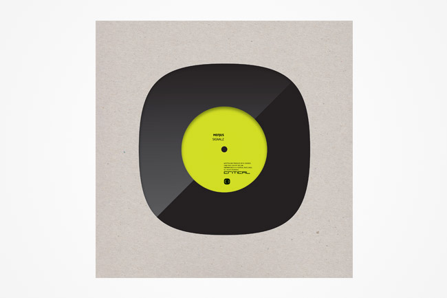
K: I feel like the Critical Sound LP shows this; nice clean lines, a bit of grit and that feel of dirty fingers rummaging through vinyl racks. This one wasn't made by Ricky though, it was made by Filthy Media.
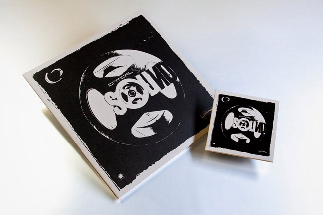 K: We also tend to use a lot of house bags for our products. We’re coming up to 70 releases and as a result of the quantity, it means that over the years we’ve had quite a few different designs. There was this, which was seemingly influenced by my love of (at the time very uncool deep house)…
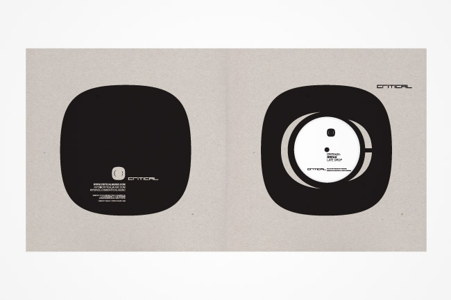
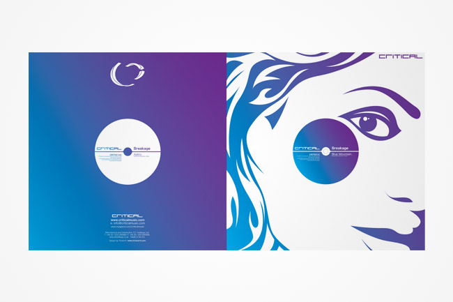 K: …which then morphed into this which has a lot more edge and feels like a more modern Critical look:
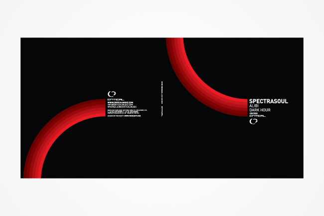 K: Then a few releases later we settled on a more stripped back and texturized look, going for the anti-slick grey reverse board and sticker combo. LO-FI but HI-TECH and all that...
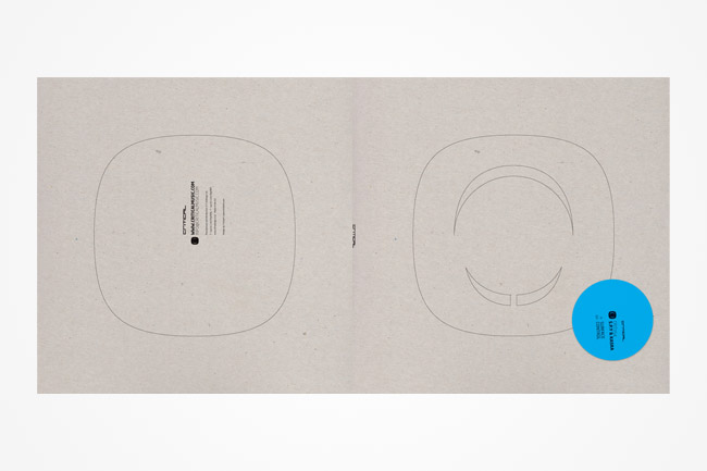 R: If I had to choose one word to describe Critical's artwork, it would be 'distilled’. We've gone through it a lot over the years and the practice has always been about getting rid of what's not needed, and giving space to what's important. In fact, we've ended up taking this to an extreme recently, with a sleeve design that featured nothing but the shape of the logo cut out of the bag. Things don't need to be big, they don't need to fill up all the available space, we don't visually hammer our fanbase and shout to tell them what a product is, and I think that's important in the label's look.
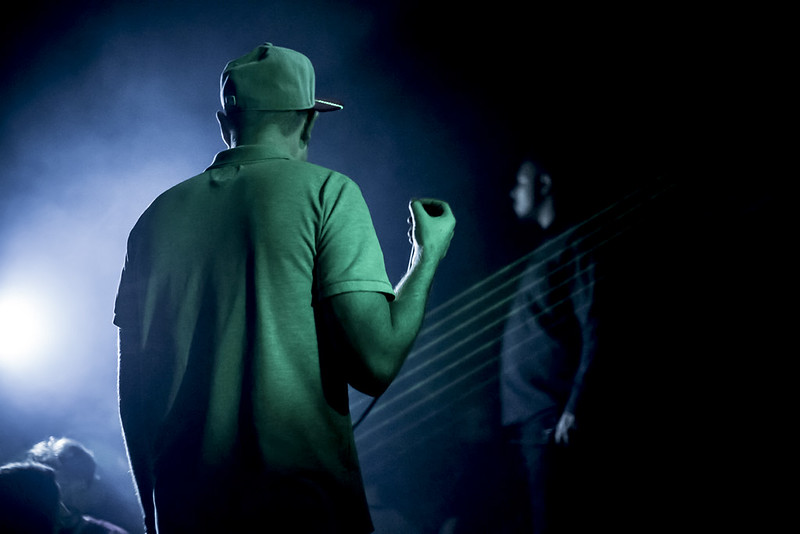
 K: And as our events have become a key part of what we do, so has the importance of documenting these and I’m always really excited by the work of our "in house" photographer (for both events and artist shots), Sarah Ginn. I was introduced to Sarah through her work at fabric and I love her style of photography, she has given us some amazing photos to remember the nights by…

 Catch Critical Sound step up to Room One for the very first time this Friday night.
Title Photo by Sarah Ginn.
Catch Critical Sound step up to Room One for the very first time this Friday night.
Title Photo by Sarah Ginn.Tags
No items found.


